 |
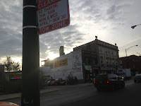
| Traffic Sign Adorned with Mind Crusher Sticker with Mind Crusher in the Distance. |
Parking Sign back to original condition
|
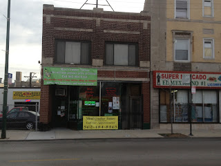
Returning to the scene of the crime. New neon sign. The California area code is a good gimmick and is a sign of the times. We are a post area code society. More and more people just hang onto their old area codes because they feel like it. Handsome black gate as well. Store front however is too cluttered with various papers and lettering. The two large canvas banners are tacky. The two curtains upstairs would look much better if they were lime green. Right now the neon sign fades into the background because there are too many distractions in the storefront. The inside should only have one lime green accent wall as having the entire place one dark color tends to make the place feel smaller. Also on the accent wall inside a mural would look sharp.


6 comments:
Jeff-O reminds me of Gladys Kravitz on the old TV show "Bewitched": going from neighbor to neighbor complaining, criticizing, giving unwanted opinions. Jeff-O, do you have your own business? What makes you a credible critic? huh?
What makes anyone a credible critic? Good question Factchecker.
Let me know what your criteria are.
I will continue the comments page monologue!
Further thoughts....
Yes declutter the storefront and put
a NICE BLACK AWNING with LIME GREEN LETTERS
either just TATTOOS or M.C. TATTOOS.
Something to catch the eye. Right now
that neon sign is lots amid the clutter
of signage/papers/stickers.
PERHAPS it would also drive business to have
it so that people could watch someone get a tattoo
through the front window. A good gimmick to do
that once a day for exhibitionists.
https://www.facebook.com/TattooRescue
What in the world. They are allowed to put stickers on their own store and decorate any way that they see fit! They pay the rent, utilities, etc. Their business, their decisions. This is just utterly ridiculous.
@Anon 4:55
Yes tis ridiculous! Especially to then assume that since they are okay with their stickers on their store to assume that they had anything to do with the stickers that were on the street pole and all the other city signs on their block.
Just a mere coincidence.
Post a Comment